UX/UI Design


Story
DAVID DAVEIGH TAKING ON GOLIATH
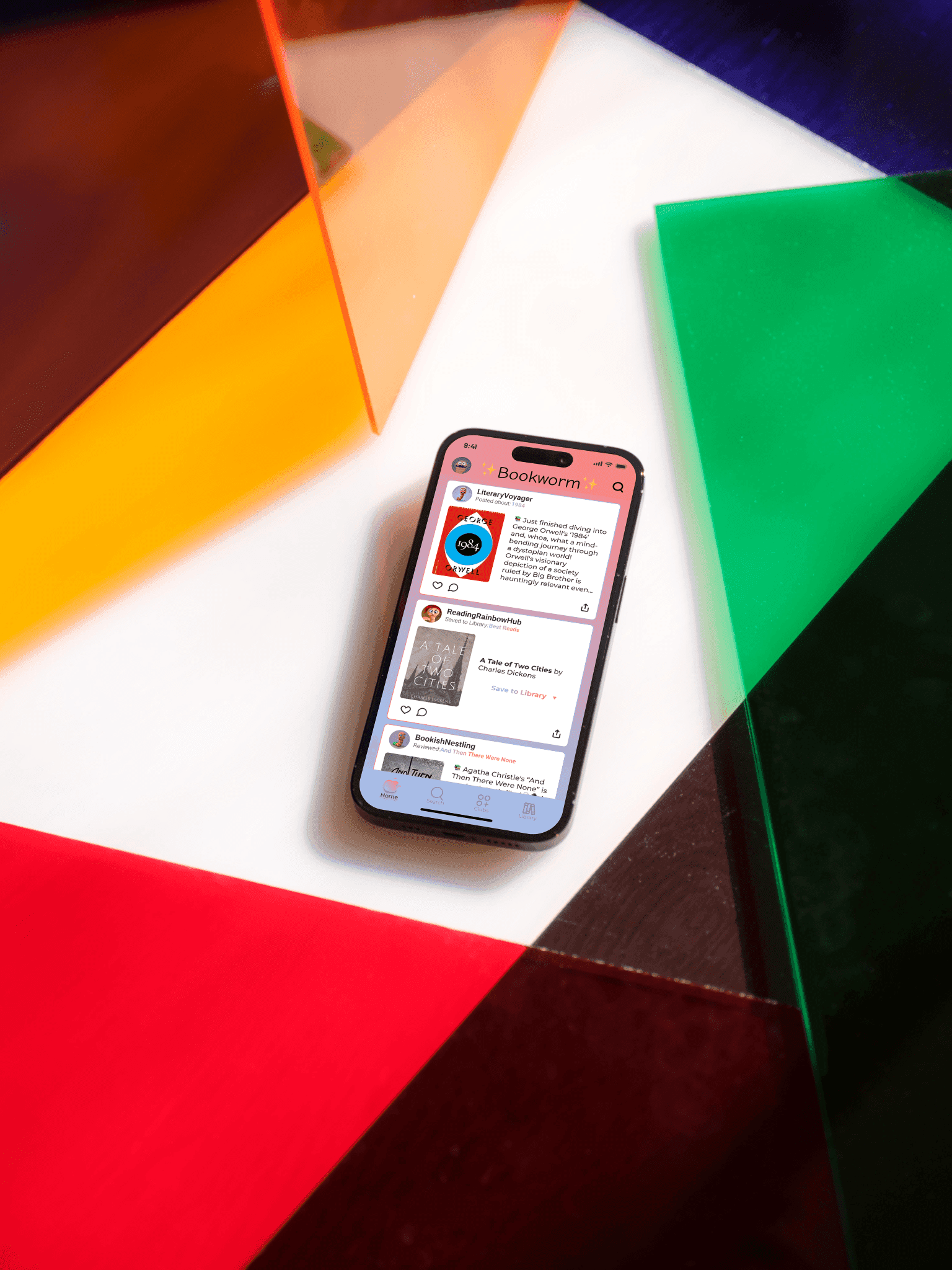
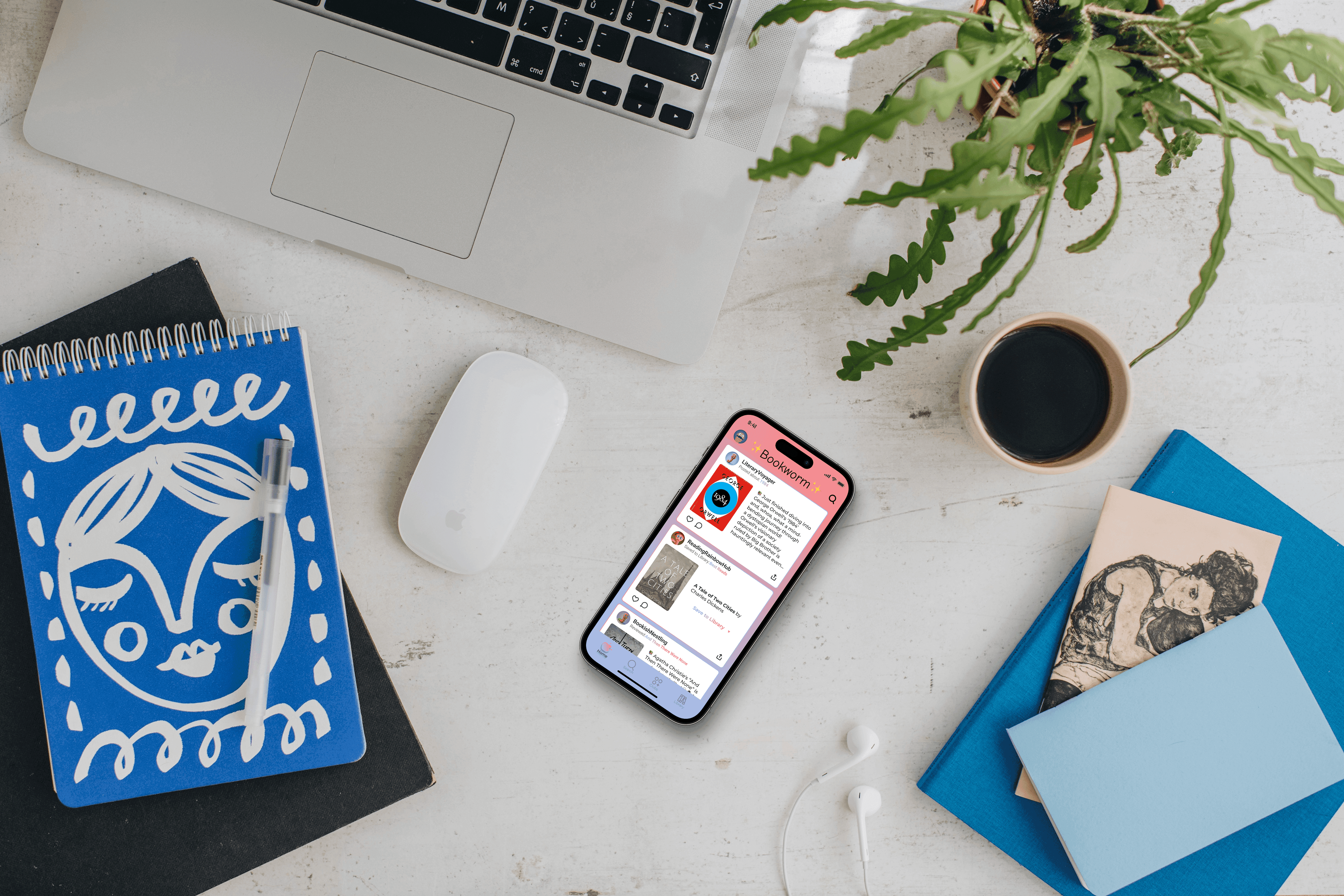
A young social cataloging app geared towards a queer femme audience called Bookworm Reads was conceived and nurtured by a collection of people who do not connect with the existing social book club platforms of today.
In just two years Bookworm Reads has exploded and become a contender to larger social cataloging platforms like Fable, Amazon's Goodreads, the Storygraph, and others.
Bookworm Reads wants to capitalize on the current momentum to catapult itself beyond its predecessors, but in order to do that it needs to surpass the common hurdles of a quickly expanded product - unclear user flows, untargeted content, incoherent design system, and cluttered information architecture
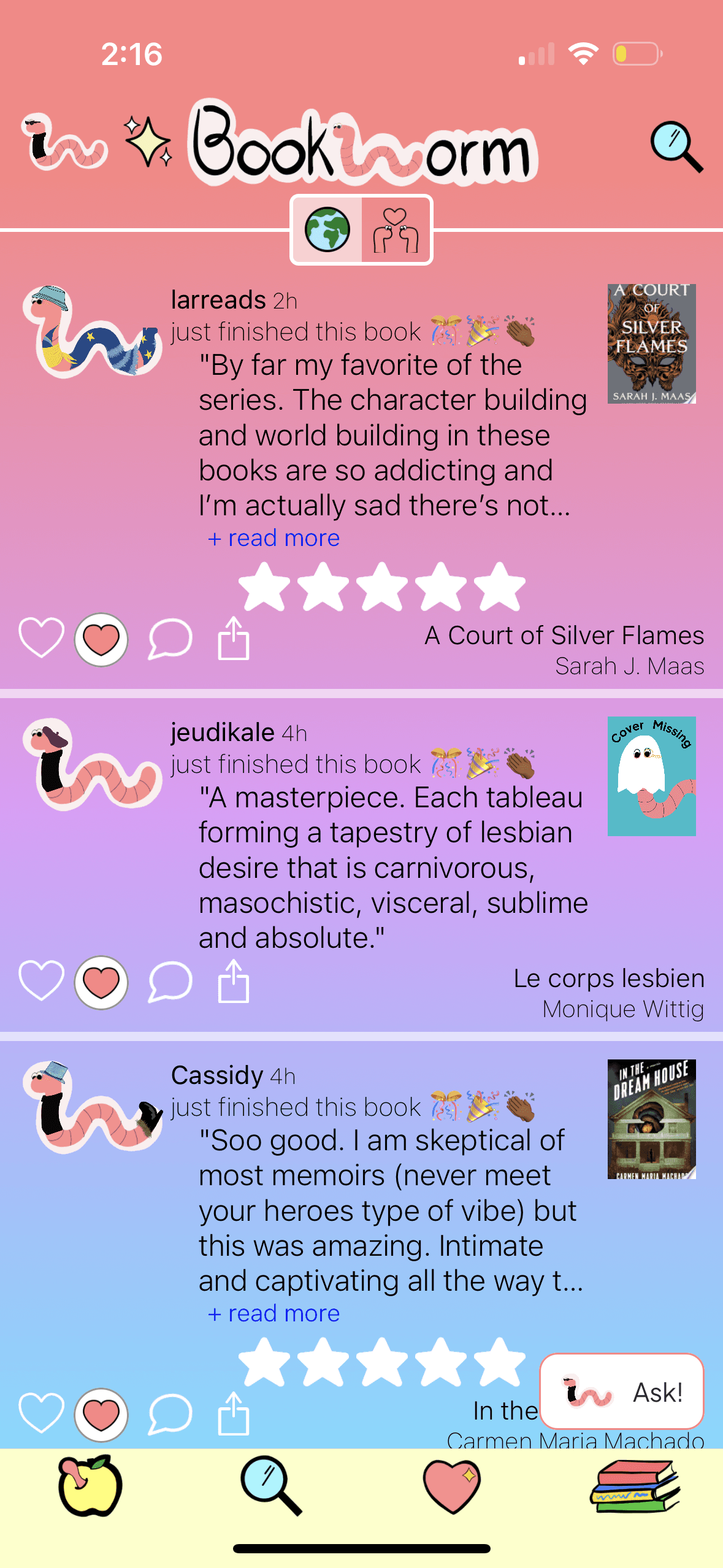
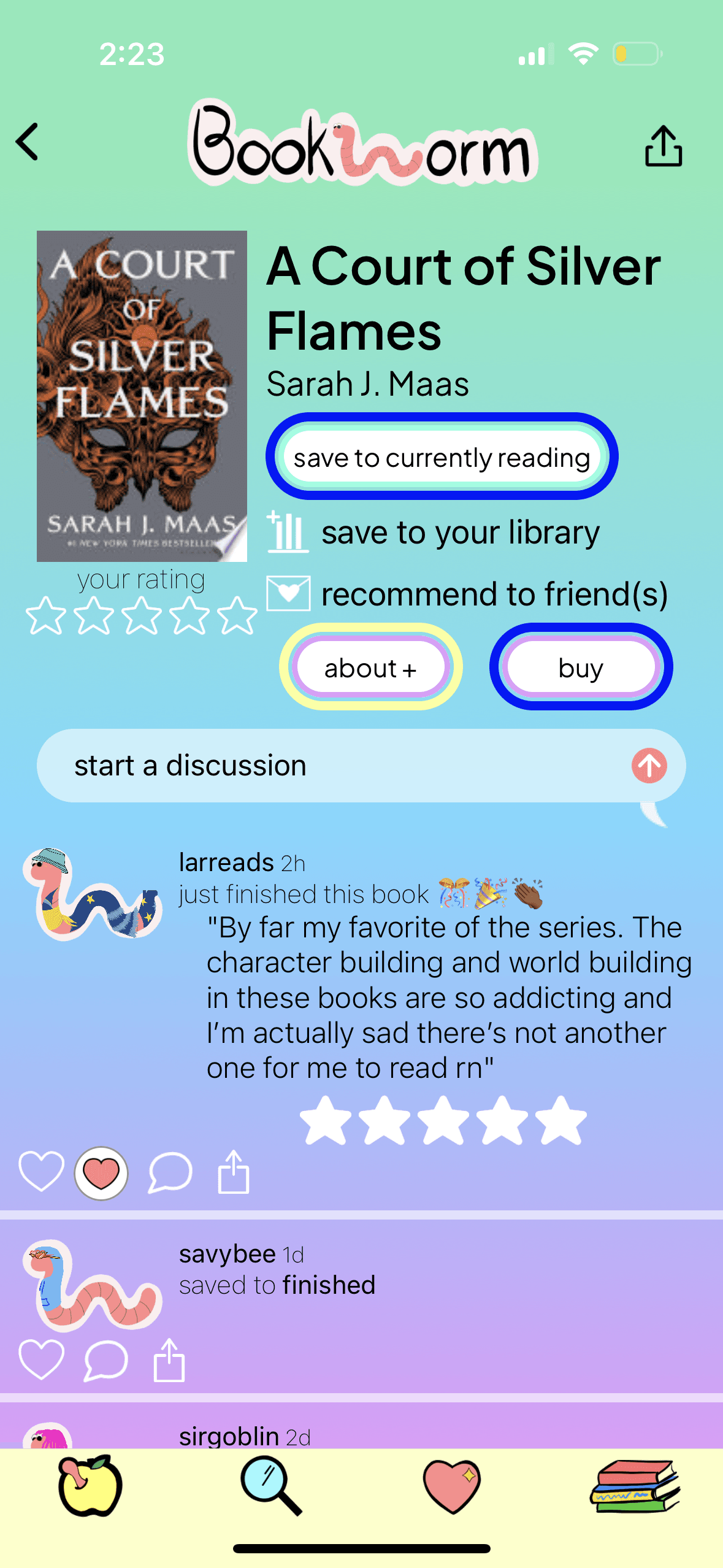
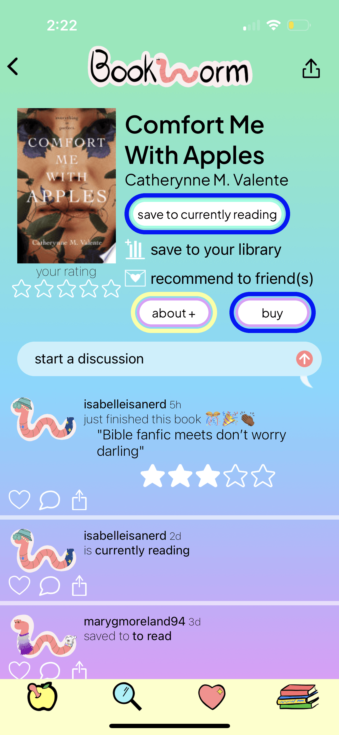
The original flow from Home (first) to book details, discussion board, reviews, etc. (the following two)
Conversations with the client revealed this was more about community than just book cataloging. The one thing the competitors could not do was provide a safe and engaging space for the queer femme community. So now that Bookworm Reads had a strong and rapidly increasing community, we had to match the same level of user experience - or better!
Competitor #1: Fable
Competitor #2: goodreads

Competitor #3: Storygraph
UNDERSTANDING THE COMPETETIVE LANDSCAPE
A variety of tools were used to conduct analysis on Bookworm Reads and its competitors including Feature Inventory. Through this I was able to comprehensively assess the functionalities and tools within the platforms, identifying their strengths, weaknesses, and relevance to streamline the redesign process for improved user experience - with a quick return rate.
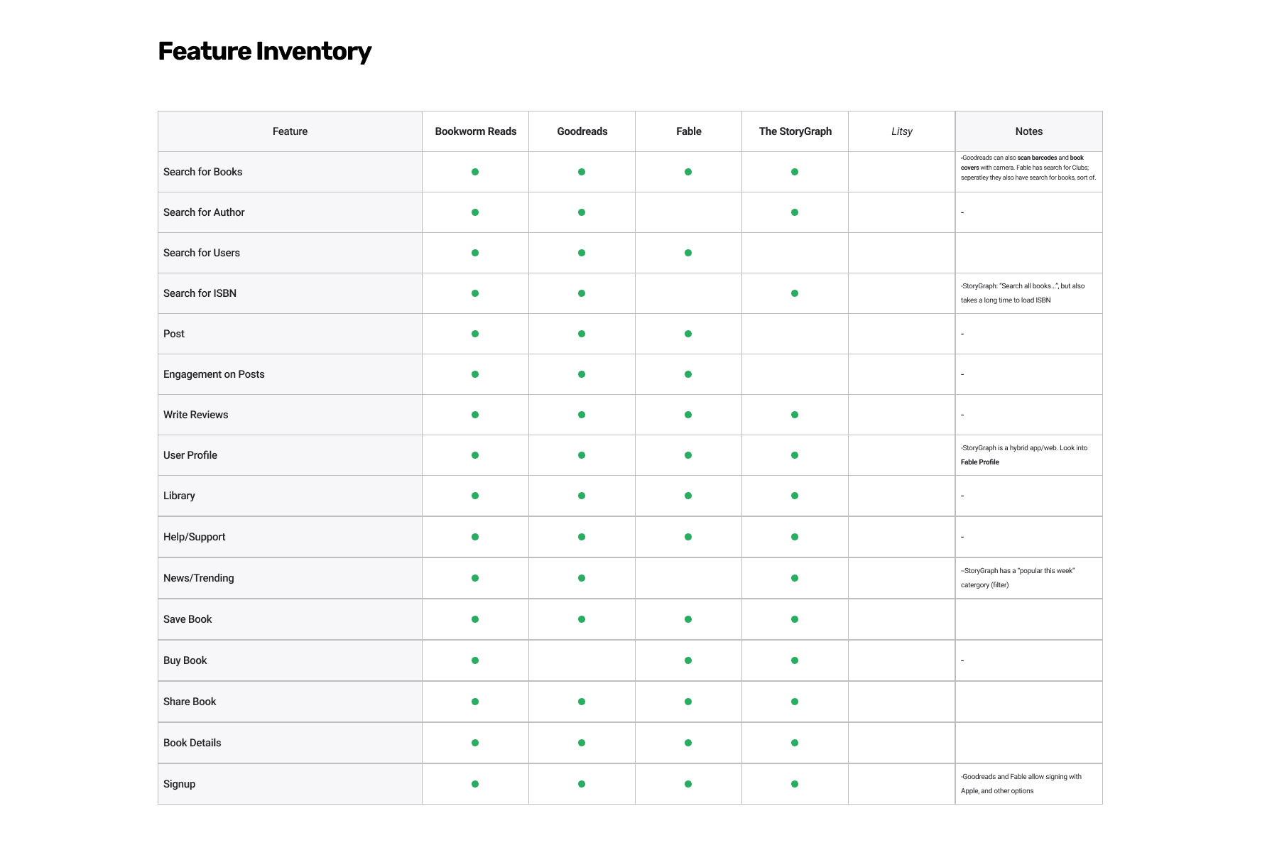
BOOKWORM READS HAS ALL THE MAINSTREAM FEATURES, OUR WORK'S DONE HERE I GUESS...
A deep dive into Bookworm Reads revealed they had a very lean and inconsistent set of features that did not provide the same value those same features did for Goodreads, Fable, or the StoryGraph. Litsy was another competitor on our radar, but after consulting with the client we concluded we did not want to pursue them for this sprint.
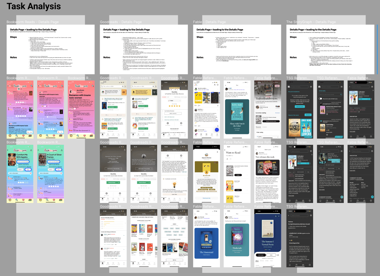
ANALYZING THE USER FLOWS: HOME > BOOK DETAILS > BOOK FORUM
SYNOPSIS AND NEXT STEPS
The same flow was all but the same. There were certainly pros and cons for each of the competitors and the client.
Goodreads could serve as a short-term goal for improvements.
Fable should be the long-term target, considering how robust the experience is.
Investing in a design system will ensure a consistent UI and brand identity.
TREADING LIGHTLY, BUT SWIFTLY
A Competitor Analysis delivered the perfect level of insights needed for a short sprint like this. There is a lot of work done in a couple days that went into this that led to the next phase.
In a perfect world, I would test, interview users, and gather more data but alas time runs with or without you - so I better catch it.
There was enough research data to move forward into the next phase - for now.
PLAN OF ATTACK
Order of priority
Refine current features, user flows, UI, and content
Test the integration of previous Goodreads users to match their needs and reduce frustrations when transitioning
Going toe-to-toe with Fable's robust features and user flows should be an ongoing target
Developing a Design System can greatly increase consistancy and strenghthen Bookworm Read's unique brand identity
THE CRITICAL USER FLOW
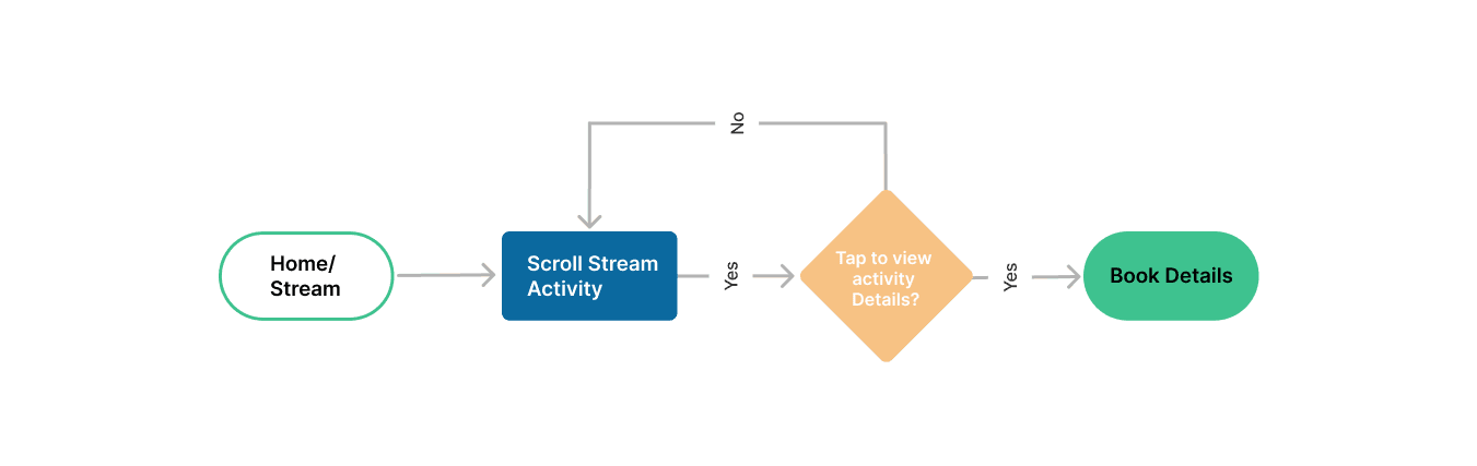
A concise flow from start (Stream) to finish (Book Details), where users can view, interact with others, and make purchases.
TWO HEADS ARE BETTER THAN ONE
Referencing the work flow priorities we start designing possible ideas that could take users from the Stream screen to the Book Details screen.
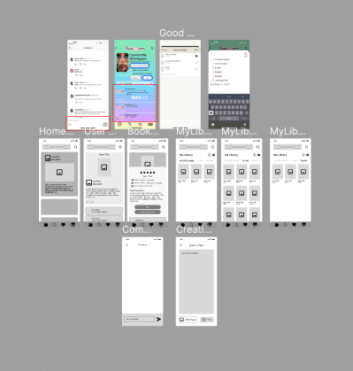
Main Screens
User Posts & Book Completion
Reviewed & Saved to Library
REFINING IS ONLY HALF OF IT, BUT DOES IT FIT THE BRAND IDENTITY?
Following the Brand Guidelines provided I combined design best practices and the client's Mission, Vision, Values, and more.
I have intentionally not shared the client's Brand Guidelines and Assets here.
Mission
Vision
Values
Colors
Typography
Content
BRAND IDENTITY IS THE BACKBONE OF BOOKWORM READS AND AN ESSENTIAL PART OF THE DESIGN PHASE.
Mid-Fi wireframes was the perfect intersection to blend ideas and brand identity.
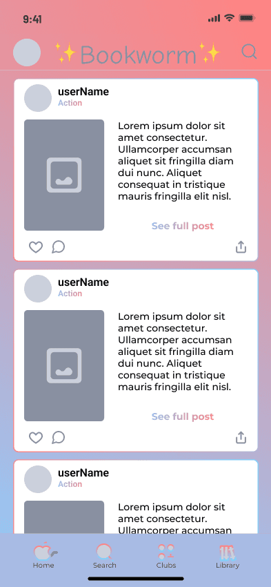
Home/Feed >
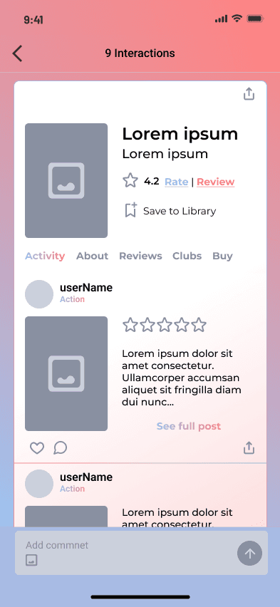
< Activity >
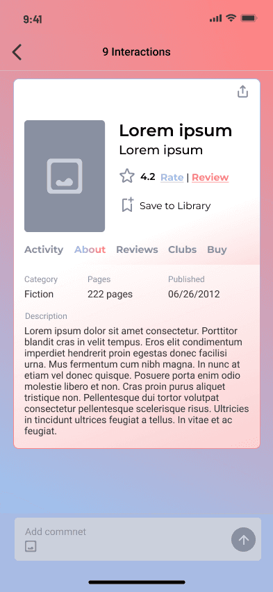
< About >
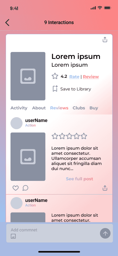
< Reviews >
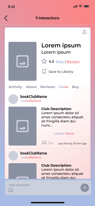
< Clubs >
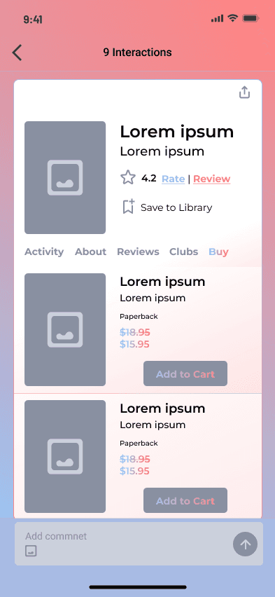
< Home/Feed
Mid-fi wireframes provided insights into the information architecture, content, features, and the flow from screen to screen necessary for the client to understand.
Here's the outcome of all the work accomplished. Let's recap - there was Client alignment, Research, User Flow, Ideation, Brand Identity, and Content consideration - and a couple of bumps and bruises along the way.
Here's the outcome of all the work accomplished. Let's recap - there was Client alignment, Research, User Flow, Ideation, Brand Identity, and Content consideration - and a couple of bumps and bruises along the way.
(Home) Streaming
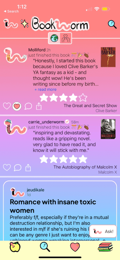
Original
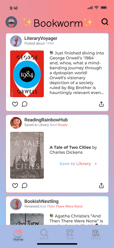
Proposed Design
Creating card components in the Home / Stream screen allowed for a cohesive look across different content and activities, including improved:
constrast
readability
consistency
layout
and more...
All Book Activity
The Book details are the largest part of the book tracking concept.
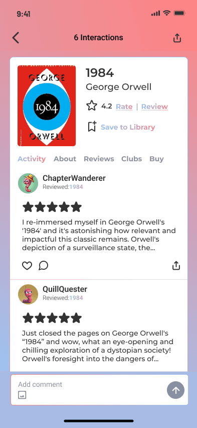
As such, I designed a more robust screen to bridge the gap between what Bookworm Reads offers and what its competitors offer, captured by the Activity tab.
A redundancy of activity between the original Home/Feed and Book page design and privacy precautions were other points of concern considered in the proposed design.
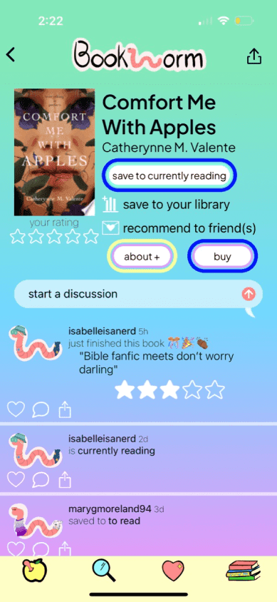
Original (Book Page)
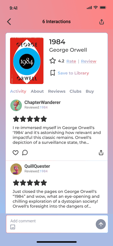
Proposed Design
Details About the Book
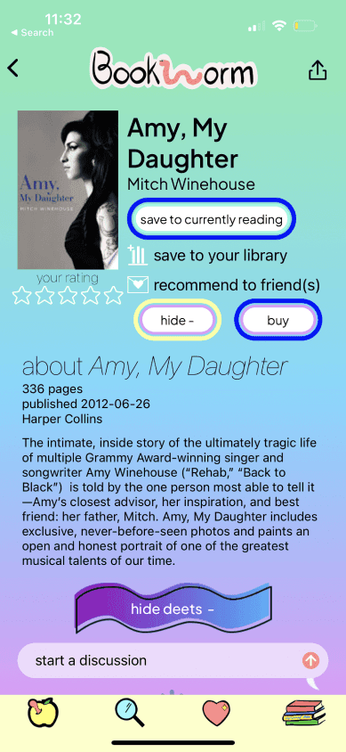
Original
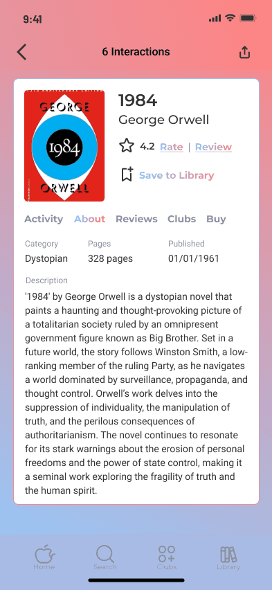
Proposed Design
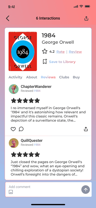
Reviews
Original
Proposed Design
Originally, reviews and ratings were featured under the same label (see original).
For the new design, there is still a persistent rate/review feature, along with a clear star rating out of five, as is the norm. Reviews is also one of the main tabs added to each book page.
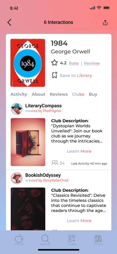
Book Clubs
Clubs section was a feature that was also integrated to close the gap between Bookworm Reads and its competitors.
Original
Proposed Design
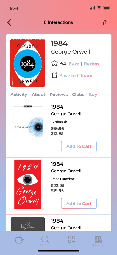
Buying Options
The Buy section on the other hand was designed to streamline the buying process and bring the experience in house from the initial external third-party website.
Original
Proposed Design
Income = $0; Outcomes =
MVP prototyped featuring the Book Details page
Redesign considering navigation, content, user flow, and common features should promote user engagement
Improved UI is matching competitors' and user expectations
User flow also includes In-app purchases as a way of monetizing and creating an end-to-end experience for users.
Prototype and documentation have been handed off to client/developer
Understanding user engagement with various functionalities and tools within the platform offers insights into user preferences, their favored features, and those that might require enhancement or reevaluation.
Shed light on the significance of aligning features with user needs and expectations.
Value of focused improvements that directly address user challenges and elevate their overall experience including User Flow and Navigation.
Contact Us
Get in Touch
We’re here to support you! Feel free to reach out for assistance, feedback, or any questions.
Let’s Talk About:
Product Design
UX/UI (User Experience) Design
UX Program Management
Industrial Design
Product Management
Get a quote
Fill up the form and our Team will get back to you within 24 hours.